
Written by Mat O'Connor
CRO has a reputation for being slow
Run a test, wait for significance, ship the winner, start the next one. Months pass. Results trickle in. It can feel like you’re barely moving.
That’s the right way to run a disciplined testing programme, and I’d defend it. But it isn’t the only way to improve a conversion rate.
There’s a category of fix that doesn’t need a test. Doesn’t need six weeks of data. It’s objectively better than what’s there now, and any experienced ecommerce person looking at your store would tell you the same thing without arguing about sample size.
These are the ones I reach for first when we start with a new brand. Most take a day. Most move something, and I’d rather show a client a number moving in week one than ask them to wait until week six.
Make guest checkout the default
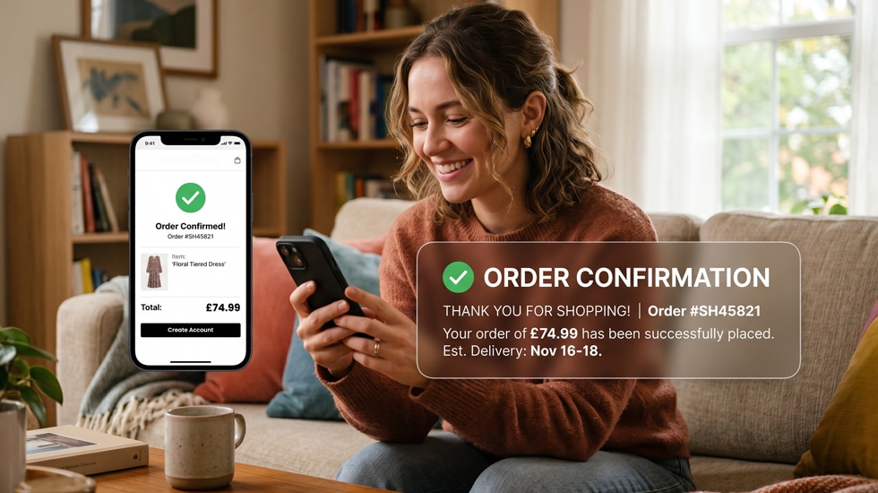
If your checkout leads with an account creation prompt, or makes guest checkout feel like the shabbier option, you’re losing sales every day.
Nobody wants to create an account before they’ve decided whether they trust you enough to buy from you. A password, a confirmation email, another form. That’s enough friction to send a meaningful chunk of first-time visitors away.
Guest checkout should be the most prominent thing on the first checkout screen. Not a small link tucked under the sign-in form. The primary call to action.
This is one of the highest-impact changes you can make on most stores. Couple of hours to implement, and you’ll usually see it in the numbers within days.
Put delivery information on the product page
Most stores hold delivery cost back until the cart or checkout. By then a lot of people have mentally committed. The number appears, it isn’t what they assumed, and you’ve got an abandoned cart.
Move it onto the product page. Not buried in a tab at the bottom. Somewhere visible, near the add to cart button. Free delivery threshold, standard cost, rough timeframe.
Give people what they need to decide before they decide, rather than after.
Fix your main product image on mobile
Open your store on your phone right now and look at a product page.
How much of the screen does the main image take? Is it big enough to show the product properly? Or is it a small square fighting for room with a header, a title and a price before anyone has scrolled?
Photography that looks great on a desktop product page often looks flat on mobile purely because the image is too small to do its job. People buy with their eyes. If they can’t see it, they won’t buy it.
Most themes let you change image sizing on mobile without a rebuild. Straightforward change, and it does a lot for how good your product looks. I’ve done this on stores where the photography budget was already spent and nobody was seeing the results of it.
Put your returns policy where people can see it
Returns anxiety is real, particularly for first-time buyers who don’t know you yet.
If your returns policy is clear and generous, that’s a selling point. Treat it like one. Put it near the add to cart button, rather than in the footer or on a separate page nobody reads before they buy.
“Free returns within 30 days” next to the add to cart button does a completely different job to the same sentence in 11px grey at the bottom of the page.
Kill the pop-up on mobile
I know. Somebody spent time setting up the email capture pop-up and list growth is a real target.
But a pop-up that fires on arrival on mobile, before anyone has seen a single product, is one of the fastest ways to lose a visitor. Especially when the close button is 8px square and slightly off the edge of the screen (you’d be amazed how often that one is true).
If you want email capture on mobile, fire it on exit intent instead. Or after 30 seconds. Or put it in the footer where the people who genuinely want it will find it.
You’ll capture slightly fewer emails. You’ll lose a lot fewer customers.
Add a sticky add to cart on mobile
On most mobile product pages the add to cart button sits somewhere in the middle. The moment a visitor scrolls down to read the description, check reviews or look at the specs, it’s gone.
A sticky bar that stays visible as someone scrolls means the action is there at the moment they decide they want it. That moment can arrive anywhere on the page. Don’t make people scroll back up to act on it.
It’s a development task, but a small one. Few hours on most themes.
Cut steps out of your checkout
Count the screens between “proceed to checkout” and “order confirmed”.
Every extra screen is another chance for someone to change their mind. Email, delivery address, delivery method, payment, review and confirm. That’s five before a purchase completes. Plenty of stores have more.
Look at whether any of them can be combined. Whether everything you’re collecting is genuinely necessary. Whether the flow can be simplified without losing something you need.
One-page checkout isn’t always the answer. But a checkout that asks for the minimum in the fewest steps will beat one that doesn’t, every time.
Get social proof into the right moments
If you have reviews, make sure they’re visible without scrolling on the product page. A star rating in small text next to the title doesn’t count. Actual review content, near the top, where people see it before they’ve decided whether to keep reading.
If you have a lot of reviews, lead with the relevant ones. A five-star review that directly answers the thing people worry about with that product is worth ten generic ones.
And if your reviews app only loads after everything else, look at whether that can change. Reviews that arrive late or flicker in and out on mobile aren’t doing the job you’re paying for. That’s usually a symptom of a wider problem, which I’ve written about in how Shopify apps slow your store down.
None of this replaces a proper testing programme. It’s what we do in week one while the CRO programme gets set up, so you’re not waiting a month to see anything change.
Which one are you doing first?
The bigger point
None of these fixes require months of testing. They don’t require a new platform or a redesign. They require someone to look at your store with fresh eyes, spot the things that are obviously working against you, and fix them.
The stores that convert best aren’t the ones that had a perfect launch. They’re the ones where someone is paying attention on an ongoing basis and making steady improvements. Our CRO service covers all of this if you’d rather have a specialist team running it.
One day of focused work on the right things will move the needle more than a year of ignoring the obvious stuff.